Yard Sign Stakes: A Comprehensive Guide to Wire Stakes

Table of Contents

What are Those?

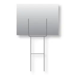
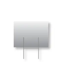
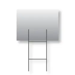
Ever wonder what those little metal looking wires are that hold up the yard signs? You know, the yard signs you see on the side of the road? They are called H-wire stakes, more commonly called wire stakes or H-wires and they are made of galvanized steel. There seems to be a variety of different types of H-wires but after just learning what they are, how do you know which to get? Here at Super Cheap Signs, we carry 4 options of wire stakes. We’ll go over the different kinds and what they’re best suited for when it comes to displaying your signs.

The Standard

Standard H-wire

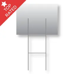
First, we have the Standard H-wire. They consist of 4, 9-gauge steel wires that are welded together to form an “H” shape, just with two lines in the middle instead of one. These are 30 inches tall and 10 inches wide and best suited for signs no bigger than 24”x 24”. These are the most common type of H-wire to see in the wild and are going to be our base of comparison for the other wire stakes we’re about to go over.

Half the size, all the hype!

Half-Size H-wire

Second, we have Half-size H-wires, which are just as they sound. Imagine taking a standard H-wire and cutting it in half. What you’re left with is 2 half size h wires. Nifty, right? These are only 15 inches tall but still 10 inches wide. Great for keeping your signs low to the ground and create the illusion that the signs are just standing upright on their own. These are also great for areas with higher winds than average. Best for smaller signs but can still hold the traditional 18×24 signs as well.

Economy’s booming

Economy H-wire

Third up on our list are Economy H-wires. These are slightly shorter than the standard wire stakes, but still stand tall at 24 inches. These also maintain the same width of 10 inches, as well as 9-gauge steel wire. Being a bit cheaper than the standards, but still offering similar results, economy H-Wires are definitely the more budget friendly option. Plus, if you need something to be displayed lower than the standard but higher than the half size, these are the perfect middle ground.

Don’t worry, these are Heavy-Duty!

Heavy-Duty wire stake

Finally, we have our Heavy-Duty H-wires. These are as the name implies, heavy-duty and meant for places where the ground is tougher than your grandpa. But seriously, the base of these are made from 3-gauge steel wire which is considerably thicker than the 9-gauge the rest are solely made of.  They still have the 9-gauge wires too, just on the top of them so that the signs can still fit. They’re the common choice for displaying signs with sizes like 24×32, 24×36, and 24×48. They can be used for signs as big as 4’x4’, as long as you use two at a time. We recommend using U-channel posts for signs 4’ or taller but this article is about wire stakes, so we’ll come back to that later. Either way, having some heavy duty H-Wires will definitely help your signs stand up to the elements, no pun intended.

The Choice is Yours!

The Choice is Yours With all these options, now you have a better idea on what would work best for your specific needs. When in doubt the standard size is going to be the safe bet. They’re the standard for a reason, right? If you have any further questions, check out our accessories page. Don’t hesitate to give us a call at 512-833-9900 and as always, we look forward to keeping on providing you with more sign knowledge in the future.

So… What kind of H-wires are there?

Constraints and Solutions: Screen Printed Yard Signs

Table of Contents

A Sign of Limitations

A lot of new people I meet or get introduced to will eventually ask me what I do for a living. When I explain that I work at a sign company, the topic of what kind of signs always comes up. 8 times out of 10, they get surprised when I throw ‘Silk Screen Printing’ in the mix. Saying things like, “Is that still effective?” or “People still do that?” Heck yea they do and believe it or not, there are a lot of pros and few cons to getting screen printed signage. You know that “WE BUY HOUSES” yard sign you always see every day, while in traffic on your way to work? That was most likely screen printed. I usually elaborate further and detail the fact that besides what type of equipment you have, you can screen print almost any design. From a 4-color process print to a simple one-color sign that’s all text, it can be screen printed. Of course, there are some downsides to screen printing too, but that’s why you’re here, to find out about the benefits and more so the limitations of these types of signs.

Screen Printed VS Digital Printed

To know the limitations of screen-printed signs, we would have to get familiar with the opposition as well. You might be thinking, “Screen-printed signs as opposed to what?” Digitally printed signs of course. In the more modern world of advertising, screen printing sort of became a thing of the past as newer and more technologically advanced printers became available. Specifically, inkjet and laser printing started to allow shop owners to offer full color designs in a much more efficient way than what was previously capable. Full color printing is still very possible to do in screen printing, however, it’s incredibly more tedious and the margin for error is extremely small with what’s called a 4 color Process print.

It is more commonly known as CMYK printing, where we take specific values of Cyan, Magenta, Yellow, and Key (Black) and print each color one at a time as a series of what appears to be random dots that fall on top of each other to make a full color print. Confused? Just look at a comic book from the 70’s very closely. If you use a magnifying glass and look at any solid color, you’ll start to notice that what appears to be specific colors are just a bunch of tiny different colored dots that somehow form this uniform color that you are seeing. Neat, right? As cool as it may be, explaining that was tough, now imagine actually doing it. The takeaway here is that just because it’s possible, it does not make it the best solution. It would take all day to print an order of 100 signs this way. When you have a machine available that could do it in a fraction of the time, it’s a no-brainer.

More Borders, Less Problems?

Another constraint for screen printing is the fact that a ⅝ – ¾ inch of the entire border must be blank. Meaning the image or design you have will never go edge to edge on your yard sign. Heart breaking, isn’t it? Well, unfortunately that border is necessary for a few reasons. The main one is the actual print process. Once the image gets printed on whatever substrate are using, that blank space around the edge is meant to handle the sign from printing to drying so that the wet ink does not get smudged going from one step to another.

Something else to consider is that if the blank border wasn’t there, then the ink that is getting pushed through the screen would fall past the edge of the actual sign and get wet ink all over the printing press. To better visualize this, let’s compare the edge of the sign to the rim of a cup. Obviously, you wouldn’t pour anything into a cup past the rim, or else it will overflow past the edge. Similarly, we wouldn’t print past the needed border on a sign, or else the ink will flow over the edge as well which would make the same kind of mess as over pouring a cup. So no edge to edge print for screen printing.

These are the main limitations that both printers and customers must consider when making and purchasing yard signs. Something else to keep in mind is that screen printing now-a-days is for bigger or bulk quantities of signs on average. I wouldn’t say this is a full-blown limitation, however, as different companies will still print smaller quantities too. I hope we were able to give you some insight and we look forward to keep on providing you with more sign knowledge in the future.

What are these yard sign limitations you speak of?

  • In Screen Printing, 1 – 3 colors are ideal, No full color designs (that’s for digital printing).
  • The more the merrier… screen printing is better for bulk orders, not just a few signs.
  • Screen printed signs must have a blank 5/8 – ¾ inch border around the edge as necessary for the printing process, No edge-to-edge printing.

If you happen to be curious on where to acquire these kinds of signs, stop on by and check us out or reach out to customer service.

Screen vs Digital: A Printing Conundrum That’s Good to Have

Screen vs. Digital

For anyone who’s been working in the print industry for some time, it would be easy for them to tell the difference between a screen-printed sign and a digitally printed one. If you’re new to the industry or if you just want a better understanding of what these differences are, then you’ve come to the right place. Instead of asking yourself which method is better, you should be asking which is better for the way you plan on promoting your signs. What you need your signs for, will help determine which option is better for you. As we jump into the different techniques, we will discover the pros and cons of each method and highlight which attributes make them worthy competitors in the industry. For this particular comparison, we’re going to assume the same material (corrugated plastic) was used for both formats.

Screen

Screen printing has been around for a very long time. It has proven to be one of the most reliable ways to get the job done and at a decent price. This technique requires a fine mesh screen that gets coated with a chemical known as an emulsion. Once dried, a stencil can then be made to print with. It then gets placed into a machine or some form of printing table where ink is added and the print can begin. The image then gets transferred to the correx, (the material commonly used for yard signs) with the swipe of a squeegee that has a good amount of pressure on it. After printing is complete, it goes under a UV light to cure the wet ink, and boom, you got yourself a sign.

Most screen-printed signs are printed with a standard color selection of UV inks, so they can be cured quickly, and they will last longer against outdoor elements. Because of that feature, they are most commonly used outside. The ink used in screen-printing also has more of a gloss finish when completed. A big reason why people use screen printing is that higher quantities can be printed at a lower cost. One downside to printing in this manner is that full-color signs cannot be done. That means you can only print with a maximum of 4 colors in one design. However, most print shops that do screen-printing limit it to 3 colors. On average, signs done with this style tend to last about 3 – 5 years, enduring the weather that all the seasons have to offer.

Digital

In the other corner, we have digitally printed signs. Digital-printing presses have become more popular lately and are commonly used for their faster turnaround times and the ability to modify an image. These signs are printed in the way the name implies, digitally, meaning a big printer that usually uses Inkjet or Laser printing to lay down a design onto the sign. It’s like a desktop printer, just on a larger scale. An image is loaded into the machine’s queue, along with the desired material, and then the print can begin. As it prints, a giant print head moves back and forth, putting down the image one band at a time, also curing the ink being used at the same time. Once finished, the sign comes out ready to use; no extra drying time needed.

Digitally printed signs are used more in an indoor setting rather than outdoor. Although the ink used is also UV ink, it’s only rated for 2 – 3 years of prolonged outdoor exposure. On the plus side, digital printing can allow full-color signs along with full bleed. Full bleed means the image goes to all edges of the sign. In screen printing, a 1/3 of an inch blank border is left on the sign. Due to these benefits, digitally printed signs are more expensive per unit than screen-printed ones.

Conclusion

Depending on your needs for signage and where you plan on having your business or campaign signs placed will be the biggest determining factor when it comes to choosing which of these methods is the best fit for you. If you have a simple design, that you need a lot of copies of, and want to put them around the neighborhood, then screen-printed signs are the way to go. On the other hand, if you need just five duplicates of an intricate layout, we would recommend the digital option for that. Let’s say you have a full-color design and need a high quantity. You’re going to land at a middle price point but might have to pay just a little extra for your signage. The same goes for a small quantity with a simple design. Since it takes more resources to make a screen-printed sign than it would for a digitally-printed one, it’s more cost-effective for any customer to go digital for an order like that. This should help give you a better understanding of the two formats and aid you in your purchasing decision.

If you have any further questions or are still apprehensive of which way to go, feel free to contact our customer service specialists who are ready to help.

Keep It In the Community: Local Marketing

In our incredibly shrinking world, “local” sounds almost anachronistic. When we can have BFFs across the country or across the globe up close and personal at the stroke of a screen, when couples have transcontinental relationships, when our food is shipped fresh and bright to grocery store shelves from another country, does GPS makes sense anywhere except in a vehicle?

Surprisingly, yes. The Go Local movement is gaining ground. From farmer’s markets to Yelp reviews, Google Maps to hyper-local ezines, people are hungry to learn more about their immediate neighborhood. Until we can drink virtual latté, this trend will likely continue.

What does Go Local marketing mean for signage?

  • Sign up for the local angle. Consider affixing “Buy Local” decals to your products or packaging to remind customers you’re a local business, and that by buying your products, their dollars remain in the community to boost the local economy. Your in-store banners and external marketing products such as sandwich boards and spinner signs should all carry the “Buy Local” theme.
  • Socialize locally. Social media is global, but that doesn’t mean your business can’t play up the local focus. On your Facebook page, for instance (yes, your business definitely needs to have one), you can reward new and existing customers who “Like” your page — which also tells other site visitors that they prefer to shop locally. The thank-you for a “Like” can be anything from a one-time discount to a small gift with their next purchase — a simple way to acknowledge support and let them know you appreciate their business. Be sure to include an image of your “Buy Local” signage on your Facebook real estate.
  • Support the community. Does the high school football team need signage for their stadium? Could your town’s SeniorCenter use some help hanging holiday banners, balloons or lights? Every community offers numerous opportunities to make a difference — and the positive PR for your business is a nice side benefit.

Who knows, with all this local emphasis, you might just find a new best buddy across town, rather than across the world.

The Grandfather of Creative Genius

In Marketing Magic/Part 1, author Debbie Millman discussed how to become a brand genius. Now she deconstructs the creative process itself as she recounts the wisdom of iconic graphic designer Milton Glaser, famous for the I♥NY logo and the poster of Bob Dylan in profile, his hair a psychedelic swirl.

Celebrated as the greatest living graphic designer, Glaser offers a wealth of insight that can help business owners create compelling signage. Take this story of how he became an artist:

“When I was a very little boy, a cousin came to my house with a paper bag. He asked me if I wanted to see a bird. I thought he had a bird in the bag. He stuck his hand in the bag, and I realized he had drawn a bird on the side of a bag with a pencil. I was astonished! I perceived this as being miraculous. At that moment, I decided that was what I was going to do with my life. Create miracles.”

While a sign doesn’t have to be fine art, there’s no telling where tomorrow’s critically acclaimed work will originate. You might think you’re simply designing a banner for your business — but if the combination of design, colors and verbiage strikes a chord, in the cyber age anything is possible. Thanks to YouTube, Facebook, Twitter, Instagram, Pinterest and many other social sites, unknowns become global sensations literally overnight.

Or maybe it’s a banner flag: the hybrid that makes a bold statement for your business, and is made to endure for seasons to come. At 11.5 feet tall and 2.5 feet wide, banner flags are hard to miss. And with our full-color UV-protected dyes and free design, proofing and logo re-creation, all you need to add is the creative genius.

So go ahead: create a miracle and let that banner wave all over cyberland, drawing customers to your door and kudos for your artistic brilliance. We’ll just remain quietly in the background.

Seven Sure-fire Tips for Real Estate Signs

When it comes to real estate success, it’s not what you say so much as how and where you say it that makes the difference. Try these tips to create real estate signs that will have competitors asking for your secret:

    • Assess your audience. While some crossover artists are able to bridge diverse worlds (think Adele’s blockbuster album, “21”), this is a rare gift. It makes more sense to sing (or write) to your intended audience. Imagine a group of teen girls turning out to hear the latest rock band, only to watch the group take the stage and croon Frank Sinatra ballads! They’d request refunds. So if you’re selling upscale, designer homes, don’t create signs that appeal to young, middle-income families. Instead, make wealth your central message: “A home for people who appreciate the finer things.”
  • Tell them what to do! It seems so obvious it’s often omitted: let prospective homeowners know what action you want them to take: stop by this weekend for an open house; call now for an appointment; email for a full-color brochure, etc.
  • Testing, one, two. Before you order dozens of signs, test your message on a market sample to make sure it generates the desired result.
  • Sell the steak. Yes, it’s common practice to sell the sizzle, but then your prospects won’t really know whether the house you have to show them will meet their needs. So give ’em the WIIFMs: “What’s In It For Me?” All the features — and all the benefits.
  • Be sure to proofread everthing. Did you notice the “y” was missing from “everything”? It’s all too easy to skip over a typo, or leave off essential information, such as your phone number or address. While the team at Super Cheap Signs takes pains to turn out a perfect sign every time, you have the final say. This is “y” it pays to have a fresh set of eyes review everything.
  • Balance visual and verbal cues. Don’t create a gorgeous sign with lackluster content, or sparkling copy with poor design. Aim for both excellent graphics and high quality content to captivate your prospects. If you need help, just ask us.
  • Learn from the masters. Do your homework, study what works and what doesn’t, and incorporate the best ideas into your own real estate signs. Who knows, someday a recording artist might immortalize your business in song!

“Cheap” Is Not A Dirty Word

Once upon a time the word “cheap” was pretty much scoffed at and thought to be taboo- but it appears that this previously taboo word may have a bit more clout in today’s economy. According to an article published on iMedia by Tom Crandall,  CEO of Ayohwahr Interactive,  “cheap” is no longer a dirty word and he appears to be right. Where companies once felt that this word would reflect upon them badly, they are quickly coming to realize that “cheap” attracts customers.  Craig Mcdonald, in his recent post, asked, “How much is the word “cheap airfare” worth in the United States? The answer is about $8 million, according to comScore Marketer Search Data, December 2007.

To Quote Tom Crandall:

“According to the Google AdWords Keyword Tool, the average monthly search volume for the phrase “cheap insurance” typically amounts to 673,000 queries. Last month, the number of queries for this term rocketed to 2.7 million. Likewise, the average monthly search volume for the phrase “cheap car” is traditionally about 1 million queries. Last month, the volume exceeded 3.3 million.

So, as you consider incorporating adjectives such as “affordable,” “budget,” “inexpensive,” “low-cost,” and “thrifty” into your SEO strategies, consider this: There is a growing number of brands weaving the keyword “cheap” into their on-page SEO elements. (Many are even incorporating this term into their marketing copy!)”

Obviously this bad word has been given a reprieve and marketers are learning that it does not damage brand perception or curb profitability. So, I can hear you thinking…. how in the world does this apply to signs? Well, the name says it all 🙂 We are cheap and we are not afraid to tell the whole world!

What about you?

How To Create A Great Outdoor Sign

Before you design your sign, be sure to consider the intended display area for your signs. Many graphic artists make the mistake of creating designs that look fabulous on their screen but not so fabulous for a large display sign. Whereas text conveys the message in an electric file, graphic design conveys the message in a large printed product such as banners and cortex Bandit signs. This is why it is so important to have minimal written content.

With all the competition available in today’s world, it’s important to best utilize the sign colors and space to produce the best possible advantage. The right text will give the most import information needed, such as contact information. But it is the colors, the layout and the design which will grab new customers.

To maximize the impact of your signs, be sure to take into consideration where you want to place your signs. The placement of your signs plays a big role in how many new customers you gain.

Here are some quick tips prior to placing your Super Cheap Signs order.

  1. View a couple of the areas or the location you will be placing your signs. Guess work can create a lot of wasted space. Outdoor signs are designed for pedestrians and motorists, the signs are expected to be more visible from farther distances than indoor signs. If most the new customers you want to attract will see them at night, you don’t want a black background with yellow letters.
  2. Vinyl banners are primarily used for its visual impact more than its word content. The visual display should be able say its message in seconds with a picture and minimal text. Use contrasting colors so the words and or pictures stand out. The colors you use in your banner should not match the color of the building or placement to which you will be using to hang the banner from.
  3. Consider who will be reading the sign and who you want to read the sign. If you own a coffee shop and the community is dog friendly, your banner can show a dog sitting at a table while its owner drinks coffee.