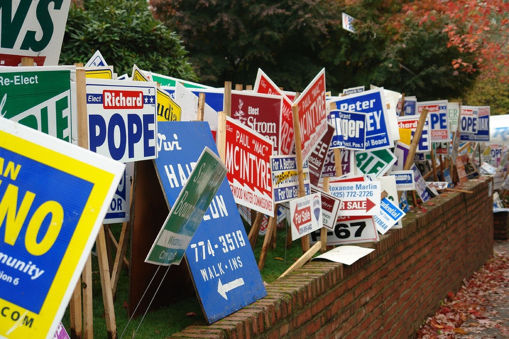
Time for a Grand Reopening

Grand Reopening
Simple, yet effective.

If business is stagnant and needs a refresh, consider a grand reopening to reboot your business. Change the look and feel of your business and reinvent what you already do. Change the interiors, update them with the new style, remodel your lobbies, and take a look at adding new services. A change of pace might be all that’s needed to invigorate an aging business. If you’re in the restaurant business, you might need to refresh the menu and add some new items that the customers might be craving.

If you’re considering a grand re-opening you’re going to want to consider how you’ll inform the public that already knows you’re there or has forgotten. Word won’t get around that an already established business is reopening its doors. A new store sign that’s refreshed for the times will help but if people aren’t looking for a redesigned store, they won’t find it. A good way to initially advertise the grand reopening is by using vinyl banners outside the business to announce the news. Banners are large and are nearly impossible to miss. Every store in a strip mall will have a sign that’s similar looking. Not everyone has an eye-popping vividly color banner. Draw attention with the banner so people know you are there.

Additionally, you can use lawn and yard signs to advertise in the surrounding areas. Place your lawn signs near the intersections with all the hustle and bustle, and place them near your place of business so that at the very least, drivers that see the sign might turn for a second to see what’s going on at your store. They might notice the new changes and be interested in coming for a later visit. Be sure to reach as many people as possible with the new signs and banners. Use your signage to briefly explain what changes have been made. New Menu Items? Tell them! New services? Tell them!

Refresh your business, attract attention, and build a new customer base. Those are the key steps to invigorate your business.

Bandit Signs: Making a “Stand”

Table of Contents

Elevate Your Outdoor Advertising: Modern Solutions for Displaying Bandit Signs

In today’s marketing landscape, visibility is key. Whether you’re drumming up attention for a local event, promoting a real estate venture, or rallying support for a cause, bandit signs can be a powerful tool in your promotional arsenal. But how do you ensure these signs stand out and comply with local regulations? Explore three contemporary and effective methods for displaying your bandit signs:

1. Metal H-Wires: The Durable Choice

For a sturdy and reliable option, metal H-wires, also known as wire stakes, are your go-to. Available in various sizes, including large H-wires for bigger signs and smaller half-wires for compact displays, these stakes are designed for easy installation. The H-wire’s design allows you to slide the top part through the flutes—corrugated plastic slats—of your bandit sign, securing it firmly in place. Then, anchor the sign by pushing the stake’s bottom into the ground. Choose from regular or heavy-duty H-wires to match your durability needs.

2. Wooden Stakes: The Eco-Friendly Alternative

Prefer a more natural look? Wooden stakes offer an eco-friendly solution for sign placement. This method involves driving a wooden stake into the ground and attaching the sign to the upper portion using staples or nails. While this option might require more effort and may not be as stable in certain soil types, it’s an economical choice suitable for softer terrains. Wooden stakes blend seamlessly into natural settings, making them ideal for community gardens, parks, and rural areas.

3. Sign Staplers: The Versatile Option

For maximum flexibility, consider using a sign stapler or staple gun. This method allows you to affix your bandit signs to existing wooden structures, such as trees or utility posts. However, it’s important to exercise caution and respect for property and local laws; attaching signs to telephone poles or other utility structures is often prohibited and can damage property. Always seek permission if using public or private structures to display your signs.

Making an Impact with Responsible Sign Placement

Once you’ve chosen the best display method for your bandit signs, it’s time to strategize their placement for maximum visibility while respecting community standards and legal guidelines. Effective sign placement not only captures the attention of your target audience but also demonstrates your commitment to responsible advertising practices.

Remember, the effectiveness of your outdoor advertising campaign hinges not just on the message you’re broadcasting, but on how and where you choose to display it. By selecting the right method for your bandit signs, you’re setting the stage for a successful and impactful promotion.

Signage Recipe: Cooking up Effective Banners and Signs

Ok, so what in the world do I mean by “signage recipe?” I can already hear you thinking that I have gone right off my rocker. But this is a very effective analogy when you get right down to it. Having that perfect recipe for cooking is the goal of chefs around the world. Obviously because this is the only way of making customers remember them and hit sales. Now, let’s relate that to advertising: a perfect recipe is also needed when coming up with advertising campaigns in order to catch the taste of consumers and get their support for your product.
Custom Banners

Your experience may tell you that in order to have an effective banner or sign you have to follow a lot of solid principles that most graphic designers use to create attractive, high impact custom signage that will help you yield the greatest return on your advertising expense. This is true most of the time because they are the experts. Some entrepreneurs spend their money just to get the experts’ advice. However, with a few tips you can save some of that expense and get straight to creating that special sign recipe that will have clients wanting more.

You need to meet with your colleagues to discuss exactly what you want to display on your banners and signs because just one missing ingredient can have a negative effect. You want to be as clear and concise in as little space as possible because the majority of people are either driving by at speeds that demand their full attention (meaning you get just that two second glance to make your impression), or they already have their own goals and objectives in mind when they glance over and you want to create enough lure to make them stop and take notice. A jumble of words will have them walking on pretty quick or turning their attention back to the street.
Custom Sale BannersWe all know about IM and text messages. We also (most of us) have joined one or two (maybe more) social networks online. Etiquette says that all capital letters means you are yelling. While yelling might be what you want sometimes (come on, admit it…) yelling at customers is not one of those times. When creating that special recipe for your banners and signs, do not use all capital letters. Contrary to popular belief, this does not make you message stand out more. Mixing upper and lower case text is friendlier to the eye and has been scientifically proven in visual tests to be more legible. You may have thought (or used?) that using those capitals would a great attention grabber when it can actually have a very negative impact. Remember your manners and who you are. Be polite. Don’t yell. You are not desperate so don’t give that impression!

Be careful when choosing the text font for your message. Don’t overdo the text in an attempt to stand out from the crowd. To maximize legibility of your text use an easy-to-read text. In addition, do not use more than two different type faces in one banner or sign. This is also irritating to the eye and can have people turning away before they ever get your message!

That perfect dish can be a mouth watering delight or it can be a savory hint of flavor and spice. When it comes to cooking, less tends to be better. Too much spice can bury the flavor of the dish. The same applies to advertising. The general rule of thumb is the fewer words the better. This is because you don’t want to jumble your message with a lot of meaningless chatter; doing this will simply make your message a hodge podge and the meaning will be utterly lost on your audience. Fewer words will make it easier for people to retain the message you want to convey. Another key thing to remember: the less you say the easier it is to remember later!

When cooking, “HOT” spices generally have a red label, mild spices tend to have yellow or pastel labels (go on, go check the spice rack…), and bolder spices – those packed with stand out taste – have a lot of black, yellow, white and red in their labels. Have you ever wondered why? No? Well… you should! Color says a lot. You can say SALE in bright red words with a white background and you have just caught the attention of about half the population. Saying Sale in big black letters on a red background will not have the same effect because it appears too aggressive. Your color scheme is just as important as your message.

To make a perfect sign recipe, use a subtle blend of simplicity, color and appeal. Stir gently and serve!

Sign Design Basics: Logo Designs

I bet you can easily recognize all of these companies. That’s the hallmark of a good logo.


We’ve all seen them – they are everywhere we look. Whether in a book, on TV, on the street, or in a shop. Famous people stand behind them, children drive their parents bananas because of them, and people use them to decide if a purchase is worthwhile or not. Have you guessed what they are yet? No? Really? Alright then, in the spirit of fair play I’ll tell you… BRAND NAMES! I know you already knew that… you were just testing me 🙂

Every brand name in the universe (yes, I am almost positive that aliens are aware of them too) has one unique thing in common no matter how different that brand may be. This element is very important but sometimes overlooked by customers who contact us to buy signs. In case you aren’t already ahead of me again, I’m talking about logos.

A logo is the graphic element of a trademark or brand, which is set in a special typeface/font, or arranged in a particular, but a legible way. The shape, color, typeface, etc. should be distinctly different from others in a similar market.  The logo of a business should be a symbol or have a special meaning that defines a business. For example, if your business is in the computer industry such as a web designer, graphic artist, web developer, or data entry clerk, that symbol might be a computer, keyboard or mouse. When picking a logo for your business make sure the logo has a theme that matches your business and it is different from other business logos. You are looking for a unique image that will identify your business.

You would be surprised by how many people don’t even have a logo of some sort. And these things are imperative to branding your company. I want you to know, I understand. Logo creation can be a very large expense if you go to the experts (recommended), but you don’t have to spend so much. I believe in your creative potential and the power of your imagination. It IS your company, YOUR service, and you alone know exactly what the logo should represent. To get you started on that creative path, I have gathered a few resources for you:

https://www.logomaker.com/ – free logo designer (online)

https://www.designevo.com/– free logo designer (online)

https://cooltext.com/ – free text designer (online)

https://www.allgraphicdesign.com/logo.html  – tips and tools

There are a few things you should keep in mind when designing your logo:

1. A logo doesn’t need to say what a company does – it just IS
The Mercedes logo isn’t a car. The Virgin Atlantic logo isn’t an airplane. The Apple logo isn’t a computer. Etc.

2. Not every logo needs a mark
Sometimes all you need is a professional logotype (text) instead of an image to identify your business.

3. Picasso had to start somewhere
You don’t have to be an artist to sketch out some basic ideas to get you started.

4. Leave trends to the fashion industry
Trends come and go, and when you’re talking about changing a pair of jeans, or buying a new dress, that’s fine, but where your brand identity is concerned, longevity is key; don’t follow the pack. Stand out.

5. Work in black first
By leaving color to the end of the process, you focus on the idea.

6. Keep it appropriate


Designing for a law firm? Ditch the fun approach. Designing for a kid’s TV show? Nothing too serious. I could go on, but you get the idea.

7. Simplicity aids recognition


Keeping the design simple allows for flexibility in size. Ideally, your design should work at a minimum of around one inch without loss of detail. Look at the logos of large corporations like Mitsubishi, Samsung, FedEx, BBC, and the ever popular McDonalds. Their logos look simple and are easier to recognize because of it.

8. One thing to remember


That’s it. Leave your clients with just one thing to remember about the design. All strong logos have one single feature to help them stand out. Not two, not three, not four.

One.

Good luck with your logo design! We look forward to seeing it in the future J

Magnetic Signs: Rules of Attraction

I know you have heard the phrase “opposites attract”. I’m going to have to say that’s pretty true for the most part! But the laws of attraction are varied and can seem a little overwhelming. There are so many “do’s” and “don’ts”, body language, expressions… well, you get the idea. So much to remember as if attraction wasn’t complicated enough already! How wonderful to know that there is one attracting option that doesn’t have all these rules!

You want customers – you have to attract them. The methods are still varied, but there is one that continues to stick around. Magnetic signs! See, and you thought this was going to be a totally off topic “rules of attraction” piece :).

You can use a combination of advertising methods (highly recommended) but once the signs are placed, the flyers are out, and your banners are fluttering in the wind, what options do you have for ads that get seen everywhere? Magnetic signs, of course! There are virtually no limitations on the design of a custom magnetic vehicle sign and they offer you the ease of a one minute removal.

Magnetic signs work great for:
Commercial Fleets
Official Vehicles
Service Fleets
Novelty Magnets
Realtor Vehicles
Delivery Vehicles

Magnetic signs are made of a magnetic material backing with high quality vinyl adhered to the front side of the magnet. Depending on the design, the vinyl adhered can be a full sheet of digitally printed vinyl or die cut vinyl decals placed on the magnet.

Common placement of magnetic signs include the left front door, right front door, or back of the vehicle. As a warning, magnetic signs should never be placed on fresh paint. Allow at least 60 days for paint to cure. When installing magnetic signs, ensure that both the vehicle surface and the magnet surface is clean. If even a small amount of dirt is left on the surface it increases the chances of the magnetic signs falling off and the chance that the vehicle paint job will be damaged.

Cleaning magnetic signs is very easy. You can use any household cleaner and a soft cloth. Wet the soft cloth or sponge and wipe down the sign. Always remove magnetic signs before taking your vehicle through any car wash. Also remember to periodically remove the sign and wash and wax underneath the magnet.

Car Magnets

Removing a magnetic sign is simple, Start at one side of the sign, lift off and slowly roll back. Magnetic signs should always be stored adhered to a steel surface or laid flat. Never roll up magnetic signs for long period of time, as they will retain the rolled shape after awhile and will not stay flat on the surface of your vehicle. Also do not store your magnetic signs back to back as they will lose their magnetism. Store them on a flat metal surface like the side of your fridge or a steel door.

Now you know! Magnetic signs are easy to install, great to use, and attractive!

Tips for Effective Campaign Signs

Whether you’re running for mayor or class president a good campaign sign is always going to be a vital piece of your marketing strategy.

The first thing you need to remember when designing campaign signs is that most onlookers will fly by your sign and have only seconds to take it in, so keeping things simple is important. Using basic colors such as blue, red, black, or green is effective in capturing the attention of individuals passing by without overwhelming them. Think about how well the ‘Vote for Pedro’ signs worked; it doesn’t take glitter and ribbons to capture a voter’s attention.  Using standard colors like red and blue can also help clear up what side of the political spectrum you represent such as red for republican and blue for democrat.

Besides a good design the quality of your sign is also important to consider.  Good quality campaign signs are often made of corrugated plastic with a vinyl over lay for the design.  It’s spring time and you know that means frequent rain showers.   Corrugated plastic is able to withstand any punch Mother Nature can swing.

Another aspect to consider is the placement of your campaign signs. Running for any office means you want to be known and seen.  While you’re out shaking hands and kissing babies, your campaign signs should be doing their part too.  It’s wise to map out your voting area so you can strategically place your signs along possible voter’s routes.

Campaigning can be stressful but effectively marketing yourself with campaign signs can make all the difference, Super Cheap Signs knows campaign signs, so reach out for more information.

State Regulations for Signage

Please ensure that you follow local and state guidelines for signage! I have listed each state below. Clicking these links will take you to a page that breaks out the states by city. By clicking on your chosen city, you will be presented with that cities codes. Locate the sign ordinance and ensure that you are within the regulations.

Only post signs within the legal guidelines!Step 1 – Understand the importance of sign ordinances to community beautification efforts. Local conservation groups and community-improvement organizations try to limit the size of signs, preventing them from becoming a distractive nuisance.

Step 2 – Speak with your city council about regulations restricting the use of signs attached to your buildings. Each community has ordinances that regulate the size, placement and content of signs that may be unique from other communities. In order to obey local laws, you should approach the city council with any unusual signage requests.

Step 3 – Consult with your state’s highway department about billboards and logos placed on highway exit signs. While private property owners can place any advertisement they want on a billboard, most highway departments help regulate the size of billboards to avoid distractions to drivers. Highway department officials can also help you re-size your logo to meet exit-sign standards and promote your business effectively.

Step 4 – Make sure you obey signage ordinances that regulate the placement of private business or campaign signs adjacent to public signs. Your signs cannot block those indicating street names, speed limits and traffic warnings because of public safety concerns.

Step 5 – Avoid violation of city laws that govern the color and design of business signs. While some communities allow business owners freedom to choose their design aesthetics, most cities prohibit bright colors or flashing lights to avoid traffic issues. Likewise, city councils will often prevent business owners from creating signage that is lewd or inappropriate for children.

Step 6 – Learn about the National Scenic Byways Program. Featured on Byways.org, it is devoted to protecting highways and waterways from over development, including excessive signage.

State Ordinances:

Texas
Washington
Oregon
California
Idaho
Nevada

Arizona
Utah
Wyoming
Montana
Colorado
New Mexico
Oklahoma
Kansas
Nebraska
S Dakota
N Dakota
Minnesota
Iowa
Missouri
Arkansas
Louisiana
Wisconsin
Illinois
Tennessee
Mississippi
Indiana
Alabama
Kentucky
Michigan
Ohio
West Virginia
Virginia
N Carolina
S Carolina
Georgia
Florida
Pennsylvania
Maryland
Delaware
New Jersey
Connecticut
New York
Massachusetts
Rhode Island
Vermont
New Hampshire
Maine
Hawaii
Alaska

If you have information pertaining to any of these ordinances (changes that are not listed, etc.), please email me!

10 Marketing Tips: Yard Signs & Banners

Table of Contents

The importance of marketing with yard signs and banners

Stationary outdoor advertising normally includes the use of billboards, bus benches, yard signs, and banners.  On the other hand, mobile outdoor advertising includes the use of ad signs placed on buses, taxis, or even your own vehicle (i.e. car magnets or magnetic signs).  For the purposes of this post, we have chosen to focus on certain aspects of using cheap yard signs and banners based on their cost-effectiveness.  It is well known that yard signs and banners are not only the most economical venues, but they are also quite functional and practical.

Using yard signs and banners to promote your business

The following is a list of ten marketing tips for using cheap yard signs and banners to promote and increase your business:

1.    Always use a legible text that is clear, concise, and simple to read
2.    The larger more legible fonts work best – examples include Arial, Sans Serif, or Verdana
3.    Stick to a single idea or message when designing your cheap yard signs and banners – if the idea or message is too complex, it will not have a positive impact on those commuters who are trying to read it as they pass the yard sign or banner
4.    Make it short and sweet – in other words, keep the message brief but get your point across and include an image, a company or product logo, or both.
5.    Bold, bright colors work best – to an extent that is.  Granted, we realize that you do want your cheap yard signs and banners to attract attention.  However, if they are overly garish in appearance, the commuter won’t even try to read them
6.    Choose the image you plan to use very carefully – this is especially true if you are placing an image of your face on the yard sign or banner.  We recommend using no more than three visual elements and staying away from complex scenes or landscapes.
7.    Identify what or who the advertising pertains to – your name and location are paramount because your idea or message means nothing to the consumer if they don’t know who you are and where to find you.
8.    Keep the background of your cheap yard signs and banners as simple as possible – white backgrounds always work best as other colors used will stand out more effectively and attract more attention.
9.    Don’t overdo the amount of white background that you use – granted, you do want images and messages bordered by the white background.  However, if there is too much white, the yard sign or banner won’t be as appealing to the commuter passing them.
10.    Test your cheap yard signs or banners – have a family member or friend pass by your yard sign or banner and get their reaction.  Remember, that the commuter only has about 5-6 seconds when passing by to read your message, so use that as a criterion when testing their effectiveness.

Ready to get the signage your business deserves without breaking the bank? Visit our Super Cheap Signs today and discover the perfect solution at an unbeatable price. Click here to start saving!

Yard Sign Placement Strategies

Yard Signs and their many uses

Yard signs are one of the most cost-effective forms of advertising. Whether you are promoting your home-based business or some type of event, yard signs are a great way to get the word out. Yard signs are used for a variety of reasons besides advertising a business or products, such as:

o Selling a vehicle
o Houses for sale
o Property rentals
o Political campaigning
o Network Marketing entities
o Loan and mortgage companies
o Landscapers and lawn maintenance
o Churches
o Builders and contractors

Because yard signs are such an effective form of advertising, all types of businesses and organizations can benefit from using them. When you take the cost of yard signs into consideration, you’re looking at one of the most affordable forms of advertising that a business or organization can use.

Things to consider when placing your signs

It is always recommended yard signs be colorful so they attract the attention of the people driving by. However, the key aspect here is: if you have a nice looking piece of property, you do not want the yard signs to detract from the looks of the property. Make sure that you signs have pleasing and easy to read color combinations and deigns. A nice sign is all well and good, but without a placement strategy, it may not be as effective. Here are a few tips to consider where the placement of your yard signs is concerned.

The placement of your signs is typically determined by the location of your property. In other words, if your house or place of business is located in the middle of the block, you’ll obviously want to place your signs at both ends of your property. If your lot is longer, you might want to consider placing an additional sign in the middle of your property as well as the ones on each end. We also suggest that the signs at the ends of your property are angled slightly so that they face the oncoming traffic as well as the street.

Additional strategies include the following:

  • Signs should be placed in an upright position so that they are at a 90° angle to the ground and should not lean either backward or forward.
  • The signs should be sitting between 6 inches and a foot above the ground once you have them staked in.
  • Place the signs as close to the road as what city regulations will allow – it’s a good idea to check with your local authorities about the rules and regulations involved.
  • Another strategy involves the clumping of business or campaign signs in groups of from three to five yard signs using the same message on each, or a message that reads as a sentence from sign to sign.
  • Timing should also be a part of your sign placement strategy – in other words, if you’re planning a special time-sensitive sale, put your signs out the night before the sale begins and be sure to remove them the evening that your sale ends.

Five Ways To Entice Clients Using Yard Signs

For all practical purposes, there is no more affordable and effective form of outdoor advertising than yard signs. Dollar for dollar, they are the most cost-effective way to drive foot traffic to your business or organization and generate sales. The key to having effective yard signs involves using creativity in the design of them. Be careful that you don’t overdo it though because you could detract from the impact that the sign will have on passersby. Additionally, an overly flashy sign can also be garish and detract from the looks of your business or home property.

Creativity leads to greater effectiveness when designing your yard signs. The following are five creative ways to bring in customers using yard signs:

You obviously want to put your name, address, and phone number on your yard sign. However, the creativity you use in the way you display those can make a difference in the amount of foot traffic that sign does or doesn’t generate. We recommend that you use large block 3-D lettering for the name of your business so it looks like your name is jumping off the face of the sign.

Add directional information that stands out and attracts attention. If you place signs away from your business to direct them to it, using a map that shows your location or employing direction arrows make the sign more creative and effective at attracting customers to your business. Placing a map on the sign means that you will have to use a larger sized sign so that people can see your map.

Put your company logo on your yard sign. This is what we call a “no-brainer” and is a creative way to make your yard sign more effective and bring you more customers. Your logo is the recognizer for those potential customers as it serves to identify you. The more people see your logo, the more market awareness is created.

Images and photos are creative ways to entice more customers to your place of business. It’s a psychological fact that placing a face with the name of a business or a particular product on the yard sign breeds trust for you and your business. Additionally, the use of an image, such as a photo of a product you are promoting on sale is another creative way to get potential customers to pay attention to you.

Use multiple signs in groups of three to five to send out your message. Remember the old Burma Shave or Stuckey’s signs you used to see when you were driving down the highway? That was creative genius in the finest sense of the terms where the use of road/yard signs was concerned. It should also serve as a good idea on how to be more creative with your yard signs. Use groups of three to five signs to get your message across either by having them all be identical or by spelling out a call to action.