Table of Contents
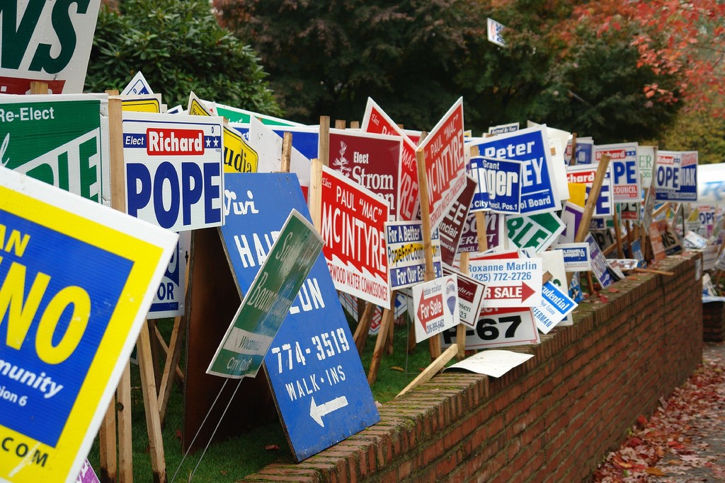
Yard signs have stood the test of time and have been most popular to 3 local markets; good old fashion garage sales, political campaigns, and real estate. There are other markets to appeal to such as small businesses or contractors, but the ones mentioned before are the three main contenders. So, what does it take to make those signs eye-catching? Is it the font or colors? Is it a unique design? With only a few seconds to attract the attention of your audience, knowing these certain insights can give you an extra boost over your competitors and could have potential clients choosing you first. As we go over these tricks of the trade, keep in mind that your signs are not limited to these guidelines and you are free to create your signs as you see fit.
Why use yard signs for your business?
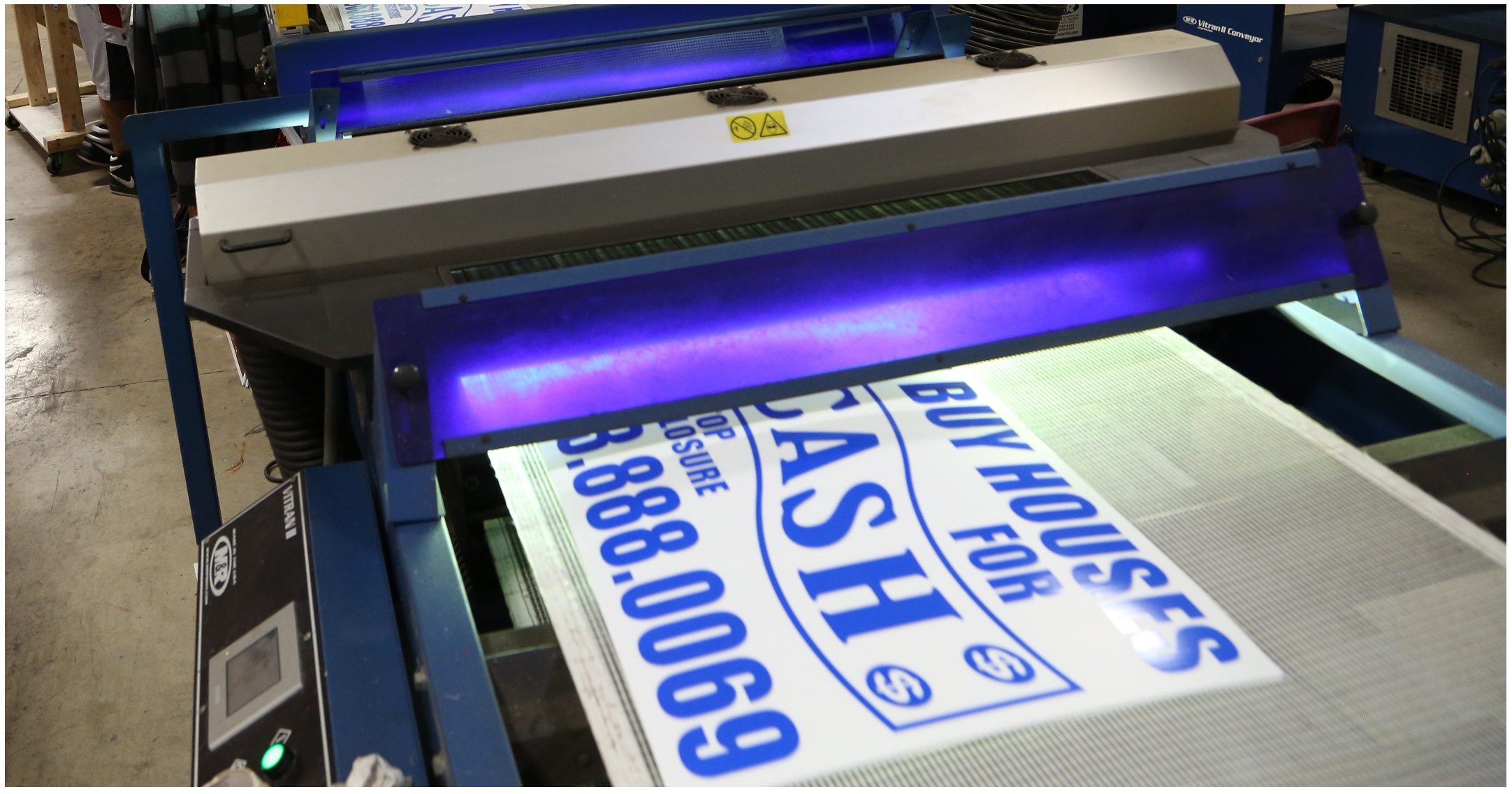
Yard signs are much cheaper than larger forms of advertising and are highly effective from a local standpoint. Made from a 4mm piece of corrugated plastic, most yard signs are 18” x 24” and are printed with a UV ink which helps for prolonged outdoor exposure. They’re less expensive than billboards, LED and digital ad displays, but will endure the elements as well.
Insider Knowledge
Something to consider when designing your sign is the budget you have to work with. The bigger the budget, the more colors and/or higher quantity you can attain. A smaller budget suggests a one-color sign at a much lower quantity. Another thing to think about is, what colors do your competitors use? You don’t want to have signs that match too closely to your competition’s colors or design. Below are more key points to help you achieve your goal of an affordable and appealing sign that gets your message across.
- Keep It Local! – Yard signs are a great local strategy for small businesses and using the local lingo to promote your message is a great way get your point across. If you can easily communicate with your community then it makes reaching your market that much more effortless.
- Keep It Simple! – By keeping the message on your signs simple and clear, you’ll be able to get more attention with just a few words. Overdesigned logos or too many words can deter someone from wanting to read your sign. For yard signs, there is a small window to nab the reader’s attention so keeping it easy to read should do the trick.
- Text Layout! – Make sure to distribute the words on your signs wisely. Too much clutter will defeat the purpose of the sign. You want to make it as aesthetically pleasing as possible, so simple fonts and bold colors are what you’re going to be looking for when designing your sign.
- Location of Signs! – High traffic areas are key to the success of your signs. You’ll also want to consider the height of which your signs are going to be displayed. Finding that perfect viewing angle can be tricky, but oh so rewarding. The surroundings of your signs are something to think about as well. You wouldn’t want a pesky bush getting in the way of your reach.
- Be different! – Having a funny slogan or a witty phrase can definitely help with standing out from the rest. As long as you keep it tasteful, non-offensive and in-line with the message you are trying to put out there, then there is no reason you can’t make a sign to remember.
These are just a few of the deciding factors to consider when creating your sign’s design. Remember, you don’t have to adhere to these methods entirely, just use what you need to help get your layout started. Hope these tips were useful and have answered some doubts you might have had about making your signs more appealing to your customers. With this new-found knowledge behind you and a wide variety of templates to choose from online, there’s nothing to hold you back from getting started!