Category: signs

  • Vector vs Bitmap

    Vector-vs-bitmap

    Table of Contents

    In the realm of digital design, especially when crafting visually compelling signs with images or logos, the choice between vector and bitmap (or raster) graphics is crucial. These two foundational types of 2D graphics serve distinct purposes and are essential tools in a designer’s arsenal.

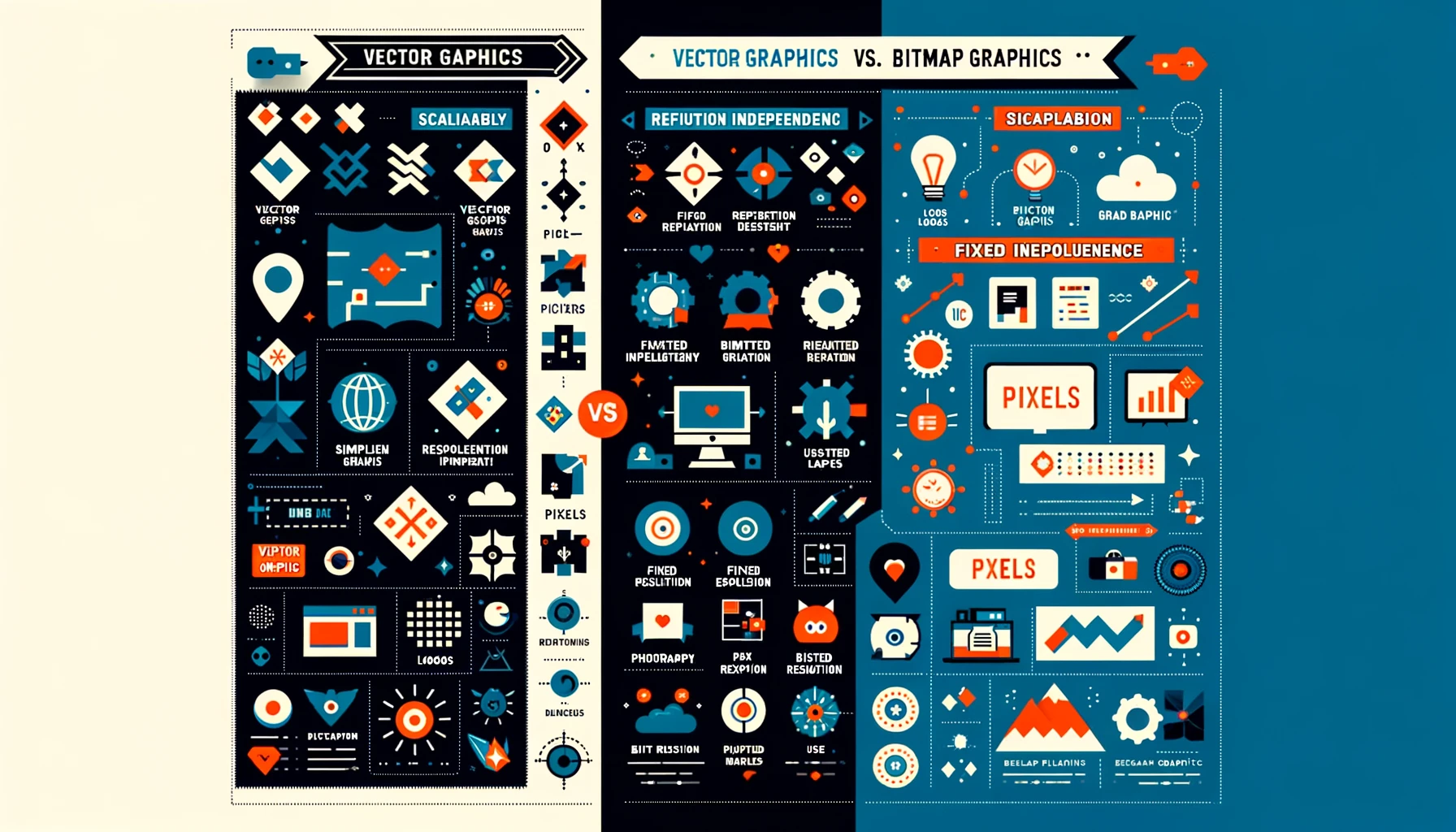
    Bitmap (Raster) Graphics: Pixel-Perfect Detail

    Bitmap graphics are digital images composed of a matrix of pixels, where each pixel holds data for its specific color. This pixel-based structure means bitmap images have a set resolution and lose clarity when scaled beyond their original size. Commonly encountered bitmap formats include JPEG, PNG, GIF, and TIFF, each with its own use-case scenarios, from web images to high-quality print documents.

    • Key Traits of Bitmap Images:
      • Pixel-based composition
      • Fixed resolution, making resizing a challenge without quality loss
      • Versatile in usage, but restricted to rectangular shapes
      • Limited transparency support, depending on the format

    Bitmap images are ideal for detailed, complex imagery like photographs, where capturing nuance is key. However, their dependency on resolution and difficulty in resizing without quality degradation can be limiting in dynamic design scenarios.

    Vector Graphics: Scalability Meets Precision

    Vector graphics, in contrast, are not defined by pixels but by paths based on mathematical equations. These paths outline shapes, colors, and fills, making vectors infinitely scalable without any loss of quality. This resolution independence of vector graphics makes them perfect for logos and sign designs that need to maintain sharpness across various sizes and mediums.

    • Key Traits of Vector Images:
      • Comprised of scalable objects, allowing for flexibility in design
      • Resolution independent, ensuring clarity at any size
      • Ideal for bold, graphic illustrations, logos, and text
      • Supports transparent backgrounds for versatile overlay applications

    Common vector formats include AI (Adobe Illustrator), SVG (Scalable Vector Graphics), and EPS (Encapsulated PostScript), among others. These formats are favored for their adaptability and precision, especially in branding and marketing materials where visual impact is paramount.

    Choosing Between Bitmap and Vector

    The choice between bitmap and vector graphics depends on the project’s needs. Bitmaps are unbeatable for intricate, photo-realistic images, while vectors offer unmatched scalability and simplicity for graphic designs. Understanding the strengths and limitations of each can significantly impact the effectiveness of your visual communication.

    For detailed guidance on file formats supported and how to best prepare your designs for production, exploring further resources or consulting with design professionals is recommended. Embracing the right graphic type not only ensures your designs are visually stunning but also optimizes your workflow for efficiency and impact.

  • How To Create A Great Outdoor Sign

    Before you design your sign, be sure to consider the intended display area for your signs. Many graphic artists make the mistake of creating designs that look fabulous on their screen but not so fabulous for a large display sign. Whereas text conveys the message in an electric file, graphic design conveys the message in a large printed product such as banners and cortex Bandit signs. This is why it is so important to have minimal written content.

    With all the competition available in today’s world, it’s important to best utilize the sign colors and space to produce the best possible advantage. The right text will give the most import information needed, such as contact information. But it is the colors, the layout and the design which will grab new customers.

    To maximize the impact of your signs, be sure to take into consideration where you want to place your signs. The placement of your signs plays a big role in how many new customers you gain.

    Here are some quick tips prior to placing your Super Cheap Signs order.

    1. View a couple of the areas or the location you will be placing your signs. Guess work can create a lot of wasted space. Outdoor signs are designed for pedestrians and motorists, the signs are expected to be more visible from farther distances than indoor signs. If most the new customers you want to attract will see them at night, you don’t want a black background with yellow letters.
    2. Vinyl banners are primarily used for its visual impact more than its word content. The visual display should be able say its message in seconds with a picture and minimal text. Use contrasting colors so the words and or pictures stand out. The colors you use in your banner should not match the color of the building or placement to which you will be using to hang the banner from.
    3. Consider who will be reading the sign and who you want to read the sign. If you own a coffee shop and the community is dog friendly, your banner can show a dog sitting at a table while its owner drinks coffee.
  • Fonts and Typefaces Could Make The Difference

    Fonts and typefaces and sizes, oh my; I mean this is pretty boring stuff. Nobody really wants to hear about it or think about it, even me, and my livelihood depends on it. Letters are the single most important part of a sign or banner, they are the building blocks of your message.

    It may be a boring topic, but I can tell you this: nothing can screw up a sign faster than typeface experiments. With that said, here are my helpful type-tips:

    • Boring fonts usually work best if you’re considering a type-face with a name like Lounge Bait or Mighty Tomato, please just stop what you’re doing and count to ten. Old stand-bys are called that for a reason, they are clean and readable use them.
    • Avoid too many words it’s tempting to put a lot of information on your sign.  Don’t do it!  Simple is best. You are not making a menu for people to sit and ponder.  You have one chance (about three seconds) to target your desired audience and then you’re done.
    • Use the right size type try to figure out how far away people will be from your sign when they read it and select your letter size accordingly. Check out the helpful chart below, it will help you build a readable sign.

    MAXIMUM READABLE DISTANCE

    READABLE DISTANCE FOR
    MAXIMUM IMPACT

    LETTER HEIGHT

    100′

    30′

    3″

    150′

    40′

    4″

    200′

    60′

    6″

    350′

    80′

    8″

    400′

    90′

    9″

    450′

    100′

    10″

    525′

    120′

    12″

    630′

    150′

    15″

    750′

    180′

    18″

    1000′

    240′

    24″

    1250′

    300′

    30″

    1500′

    360′

    36″

    1750′

    420′

    42″

    2000′

    480′

    48″

    2250′

    540′

    54″

    2500′

    600′

    60″

  • Size Does Matter (Sign Sizes, That Is)

    What can I say? Sometimes, I think of the headline before the blog topic. In this case though, it is relevant. People always come into the shop and ask us what sign size they should get.

    Signs come in a bunch of sizes: 9×24, 12×18, 18×24, 24×24, and 24×3 and that’s just yard signs. Throw in custom banner sizes and you can get a sign in virtually any size. But what’s the best size?

    I can tell you the most popular size, that’s the 18×24 standard plastic yard sign. It might not be the right size for your purpose, but it offers a good compromise between affordability and printable surface area. It’s large enough to be readable from a relatively fast moving vehicle, yet cheap enough to allow you to purchase several signs to increase your advertising area.

    Three things to consider when deciding on sign size:

    • Speed of the vehicles that will see your sign – larger signs work better at higher speed limits.
    • Complexity of message – a more complex message, requires a larger sign (see our 3 second rule to simplify your message)
    • Area of advertising zone – more signs are better for a large advertising area. Smaller signs are cheaper so you can get more for the same price.

    On our web site, you can experiment with sign size and quantity to get the best per-sign price before you even design the sign.