Alright, let’s be honest. We love yard signs. They’re fantastic for garage sales, political campaigns, birthday shouts, promoting businesses… you name it. They’re affordable, easy, and effective! Except… when they’re not. Sometimes, yard signs go rogue. They commit crimes against readability, visibility, and common sense. And sometimes, it’s unintentionally hilarious.
We’ve all seen them. The signs that make you squint, tilt your head, or just drive by completely baffled. Are you unknowingly committing yard sign crimes? Let’s review the rap sheet and learn how to make signs that get noticed for the right reasons.
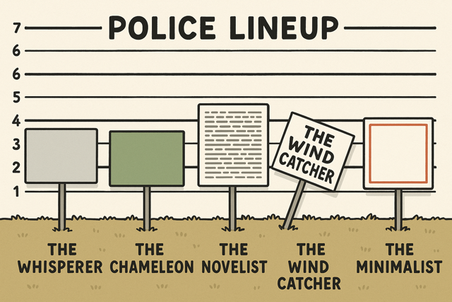
Crime #1: The Unreadable Riddle (Text Too Small or Fancy)
This is Yard Sign Felony Numero Uno. You spent time designing it, maybe even money printing it, but folks driving by at 30 MPH need a magnifying glass and a degree in calligraphy to decipher it.
- The Hilarious Fail: Tiny text, super swirly fonts that look like spaghetti threw a party, or cramming your life story into 18×24 inches. The sign might as well be blank!
- The Fix (So Obvious, It Hurts): BIG. BOLD. BORINGLY CLEAR FONTS. Seriously. Think Arial, Helvetica, Impact. Use letters tall enough to be seen from the intended distance (at least 3-4 inches tall for roadside viewing). Less is definitely more.
- Your Getaway Car: Design Readable Yard Signs at Super Cheap Signs
Crime #2: The Camouflage Catastrophe (No Contrast)
Your sign blends into the background like a chameleon at a paint store. Yellow text on a white background? Dark blue on black? Green text placed right in front of… a bush? Masterful hiding skills, terrible advertising.
- The Hilarious Fail: Signs that disappear unless you’re standing two feet away under perfect lighting conditions. Bonus points if the stake is also green.
- The Fix: Contrast is your best friend! Think dark text on a light background (black on white/yellow is classic for a reason) or light text on a dark background (white on blue/red/black). Keep backgrounds simple behind text. Let that message POP!
Crime #3: The Novel on a Stick (Way Too Much Information)
We get it, you’re excited! But your yard sign is not the place for your manifesto, detailed event schedule, and directions to the after-party. People glance, they don’t settle in with popcorn.
- The Hilarious Fail: A sign packed tighter than a clown car, with paragraphs of text no human eye can possibly scan in 3 seconds.
- The Fix: The 5-Second Rule! What absolutely must people know in a quick glance? Aim for 5-7 words MAX for the main point. Who, What, When, Where – keep it concise! Add a website or QR code for details if needed.
Crime #4: The Hidden Hideaway (Awful Placement)
You designed the Mona Lisa of yard signs… and then stuck it behind a parked car, obscured by a giant inflatable snowman (in July?), or facing the wrong direction down a one-way street. Brilliant!
- The Hilarious Fail: The sign equivalent of hiding your light under a bushel… or Bob’s pickup truck.
- The Fix: Location, location, location! Think high traffic (relevant traffic!), eye-level visibility. Angle it towards oncoming viewers. Make sure it’s not blocked by landscaping or the neighbor’s prize-winning gnome collection. Crucially: Check local rules! Placing signs illegally (medians, blocking views, utility poles) is the only actual crime here. Don’t do it.
Crime #5: The Ghost of Signs Past (Faded, Filthy, or Falling Apart)
Your sign looks like it wrestled a badger and lost. It’s faded, covered in mud, ripped, or leaning at a sad, jaunty angle. Does that scream “professional event” or “trustworthy business”? Probably not.
- The Hilarious Fail: A sign whispering “Garage Sale… I think?” from behind a layer of grime and despair.
- The Fix: Keep ’em clean! Wipe them down occasionally. Use quality signs printed with UV-resistant inks (like ours!) to slow fading. Replace signs that are damaged or hopelessly tilted. A fresh sign shows you care.
Avoid a Life of Sign Crime!
Don’t let your signs become a neighborhood joke. Keep it simple, readable, high-contrast, well-placed, and clean. At Super Cheap Signs, we provide high-quality, affordable yard signs with vibrant printing designed to avoid these fails (user error not included 😉).
Ready to create some legally awesome, attention-grabbing yard signs? Design yours today! Get Your Effective Yard Signs Here
Leave a Reply