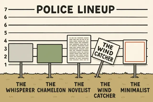
Alright, let’s be honest. We love yard signs. They’re fantastic for garage sales, political campaigns, birthday shouts, promoting businesses… you name it. They’re affordable, easy, and effective! Except… when they’re not. Sometimes, yard signs go rogue. They commit crimes against readability, visibility, and common sense. And sometimes, it’s unintentionally hilarious.
We’ve all seen them. The signs that make you squint, tilt your head, or just drive by completely baffled. Are you unknowingly committing yard sign crimes? Let’s review the rap sheet and learn how to make signs that get noticed for the right reasons.
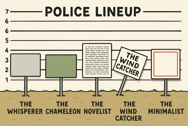
Crime #1: The Unreadable Riddle (Text Too Small or Fancy)
This is Yard Sign Felony Numero Uno. You spent time designing it, maybe even money printing it, but folks driving by at 30 MPH need a magnifying glass and a degree in calligraphy to decipher it.
- The Hilarious Fail: Tiny text, super swirly fonts that look like spaghetti threw a party, or cramming your life story into 18×24 inches. The sign might as well be blank!
- The Fix (So Obvious, It Hurts): BIG. BOLD. BORINGLY CLEAR FONTS. Seriously. Think Arial, Helvetica, Impact. Use letters tall enough to be seen from the intended distance (at least 3-4 inches tall for roadside viewing). Less is definitely more.
- Your Getaway Car: Design Readable Yard Signs at Super Cheap Signs
Crime #2: The Camouflage Catastrophe (No Contrast)
Your sign blends into the background like a chameleon at a paint store. Yellow text on a white background? Dark blue on black? Green text placed right in front of… a bush? Masterful hiding skills, terrible advertising.
- The Hilarious Fail: Signs that disappear unless you’re standing two feet away under perfect lighting conditions. Bonus points if the stake is also green.
- The Fix: Contrast is your best friend! Think dark text on a light background (black on white/yellow is classic for a reason) or light text on a dark background (white on blue/red/black). Keep backgrounds simple behind text. Let that message POP!