(And Why Others Feel Like Spam on a Stick)
You’ve probably seen it happen before.
One yard sign makes you think:
“That looks professional.”
Another makes you think:
“Absolutely not.”
Same product. Same size. Same basic idea.
So what changes?
Trust.
And the truth is, people decide whether they trust your sign in just a few seconds — often before they’ve even fully read it.
Here’s what separates trustworthy signs from the ones people instantly ignore.
🧠 First Impressions Happen FAST
A yard sign isn’t just advertising.
It’s a signal.
People use it to quickly judge:
- Whether your business feels legitimate
- Whether you look established
- Whether you seem organized
- Whether they’d trust you at their home or business
And those decisions happen almost immediately.
🎨 1. Clean, Simple Design Builds Confidence
The fastest way to lose trust?
Trying to cram too much onto the sign.
Signs that feel trustworthy usually:
✔ Have one clear message
✔ Use large, readable text
✔ Have plenty of empty space
✔ Feel organized and intentional
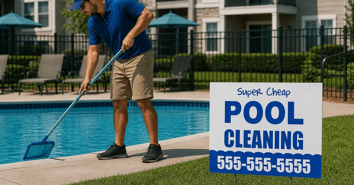
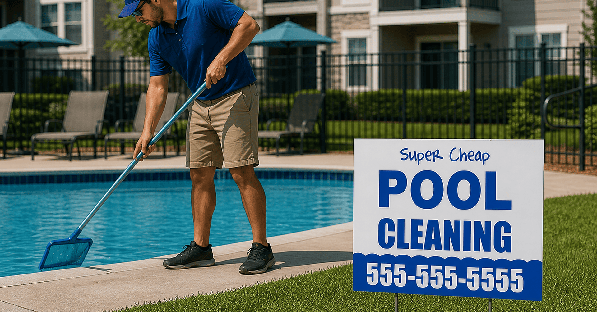
Signs that feel sketchy usually:
🚫 Overcrowd the layout
🚫 Use tiny text everywhere
🚫 Try to say too much at once
Simple reads as professional.
Clutter reads as desperate.
🔠 2. Easy-to-Read Fonts Matter More Than Fancy Ones
You know what builds trust?
Being readable.
That means:
- Bold fonts
- Thick lettering
- Strong contrast
- Clear hierarchy
Not cursive.
Not thin scripts.
Not overly decorative fonts.
If someone has to work to read your sign, they stop trusting it.
💛 3. High-Contrast Colors Feel More Legit
Color psychology matters more than most people realize.
Strong combinations like:
- Yellow + black
- Yellow + red
- White + blue
- Red + white
feel:
✔ More visible
✔ More intentional
✔ More established
Meanwhile low-contrast combinations can look faded or homemade — even if the sign itself is professionally printed.
💡 Yellow coroplast with red or black ink is one of the best-performing, budget-friendly combinations because it stays readable in almost any weather condition.
📏 4. Bigger Isn’t Always Better
A trustworthy sign feels proportional.
If the logo is gigantic and the phone number is microscopic, something feels off.
Good signs prioritize:
- What you do
- How to contact you
- Your business name
That order matters.
People trust signs that communicate clearly and quickly.
🏘️ 5. Placement Changes Perception
Even a great sign can lose trust if it’s:
- Crooked
- Half-fallen over
- Buried in weeds
- Blocking a sidewalk
Meanwhile, a neatly placed sign near:
- A flower bed
- A mailbox
- A clean jobsite
feels intentional and respectable.
Presentation matters.
🌱 6. Smaller Signs Can Feel More Trustworthy
This surprises people.
But in many neighborhoods — especially HOA-heavy areas — smaller turf signs (9″x11″) often feel:
✔ Less intrusive
✔ More polite
✔ More professional
Homeowners are also more likely to leave them up longer.
That means:
- More visibility
- More familiarity
- More trust over time
🔁 7. Fresh Signs Feel Active
A faded sign sends a message too.
If your sign:
- Looks sun-bleached
- Has warped corners
- Has clearly been sitting there for months
people subconsciously think:
“Are they even still in business?”
Fresh signs feel current.
Current feels active.
Active feels trustworthy.