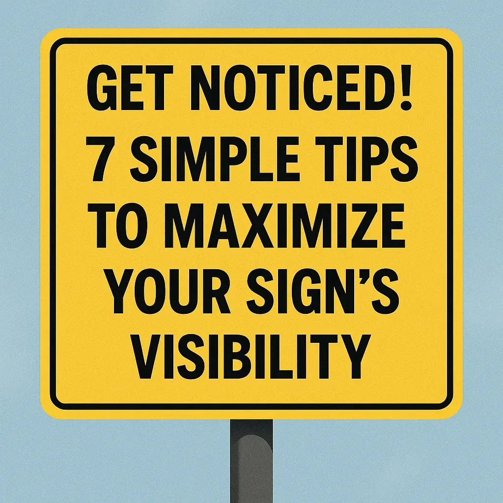
You’ve invested in a sign – maybe a bright yard sign for your event, a banner for your grand opening, or a magnetic sign for your vehicle. That’s a great first step! But is your sign actually being seen? Even the most affordable sign from Super Cheap Signs needs a smart strategy to grab attention and deliver your message effectively.
An unseen sign is a wasted opportunity. The good news? Making your signs more visible doesn’t have to be complicated or expensive. It’s about being strategic. Let’s dive into 7 simple tips to ensure your message hits the mark.
1. Design for Distance: Size & Font Matter
People often see signs from afar or while moving (walking or driving). Your design needs to account for this.
- Go Big (with Text): Use large, bold fonts. The further away people are, the bigger the text needs to be. Test it! Can you read it easily from the intended viewing distance?
- Choose Clear Fonts: Fancy scripts are hard to read quickly. Stick to clean, sans-serif fonts (like Arial, Helvetica, Verdana) for maximum legibility.
2. Contrast is King
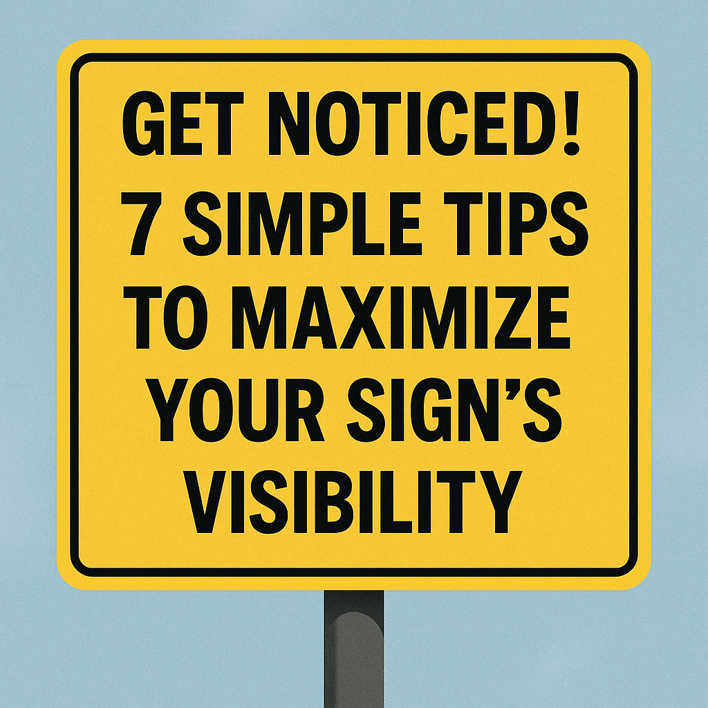
Colors that blend together make your sign invisible. High contrast makes it pop.
- Think Opposites: Dark text on a light background (e.g., black on white/yellow) or light text on a dark background (e.g., white on blue/black) works best.
- Avoid Busy Backgrounds: Complex patterns or photos behind text can make it incredibly difficult to read. Keep backgrounds simple where text is present.
3. Keep Your Message Short & Sweet
People rarely stop to read a novel on a sign. They glance.
- Focus on the Core: What is the single most important piece of information? (e.g., “Grand Opening,” “Garage Sale Sat 9 AM,” “Vote Smith,” “House For Sale”).
- Use Fewer Words: Aim for 5-7 words maximum for headlines or primary messages if possible, especially for roadside viewing. Add essential details (like a date, address, or phone number) clearly but secondary to the main point.
4. Location, Location, Location (and Angle!)
Where you put your sign is just as important as what’s on it.
- High Traffic Areas: Place signs where the most relevant people will see them. Consider foot traffic and vehicle traffic flow.
- Eye-Level: If possible, position signs where people naturally look. For yard signs, ensure they aren’t hidden by parked cars or landscaping.
- Angle Wisely: Don’t place signs flat against a wall if traffic flows parallel to it. Angle them towards oncoming viewers. For corner locations, consider two signs facing different directions.
- Check Local Rules: Always be aware of local zoning laws and regulations regarding sign placement (size, location, duration). Check with your local municipality.